graphic design is my passion
click here for era appropriate music
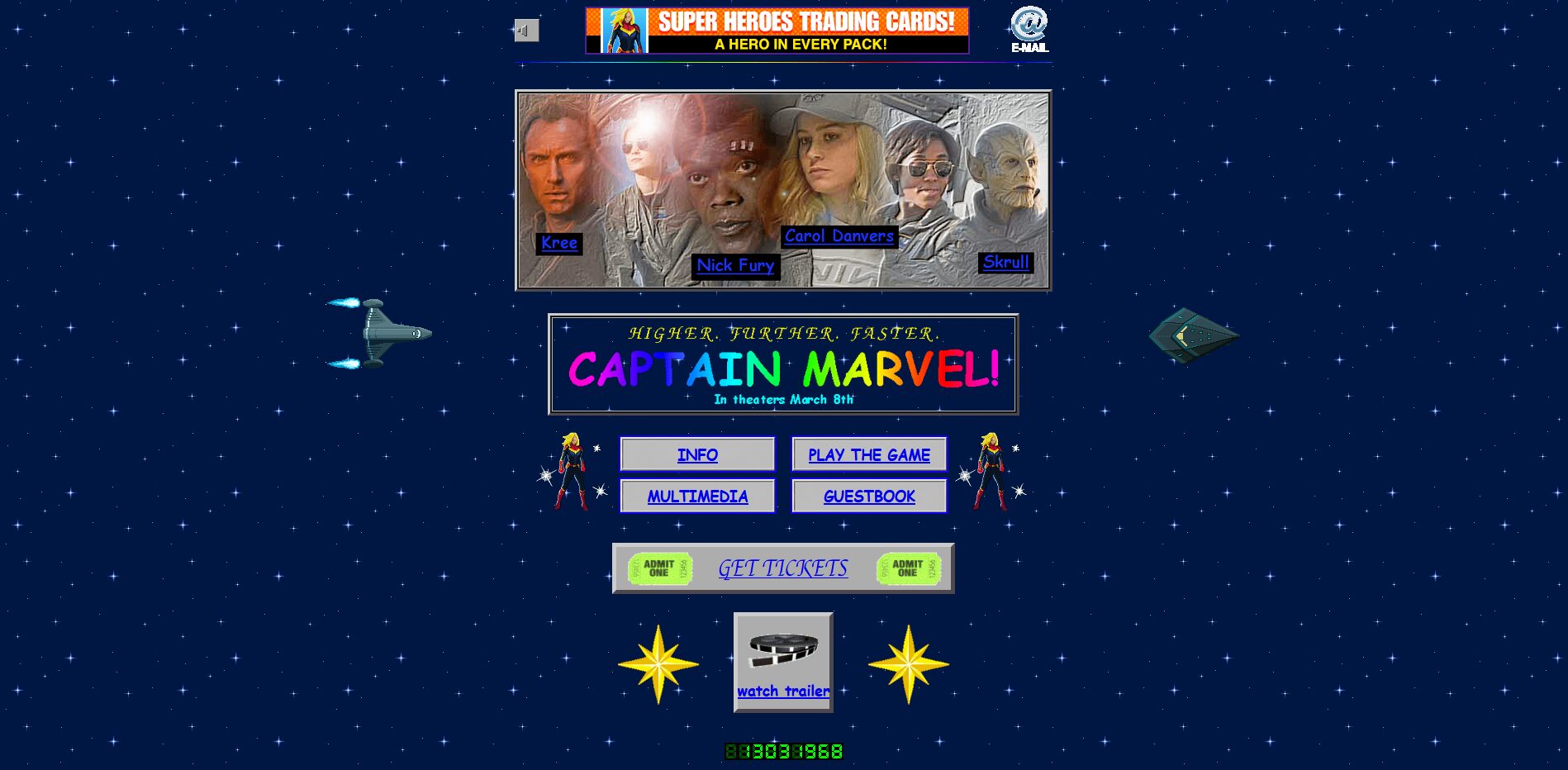
Ahh, is there anything more comfortable than the past? Well, the site for Marvel’s Captain Marvel certainly thinks so. Because those of you old enough to remember a time where the internet was like a series of tubes that could get clogged up will enjoy basking in its sharply designed glow.
It’s also very era-appropriate for the 1995-set Captain Marvel. And according to a tweet from Marvel software engineer Lori Lombert, they achieved that look legitimately.
I mean, mission accomplished, there. It’s no Space Jam, but it’s pretty damn close. And that’s the point.
Source: Engadget

