Uh… why?
So, most companies, forums, etc. add a dark theme so as to preserve your sight when you look away from the screen. It’s usually not the default choice; that would usually be the light theme. As a matter of fact, Windows 10 already has a light theme. Which is why it’s puzzling that they would add another light theme, only this time, more light.
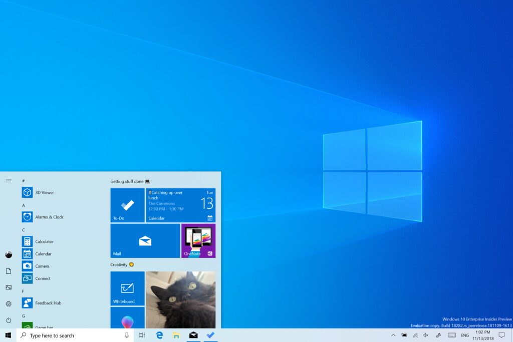
Yes, more light. See, the default light theme still features black borders on certain elements, such as the task bar, which normally remains dark even in light mode. The new light mode will replace the old, and brighten up these elements with more shades of white and light gray.

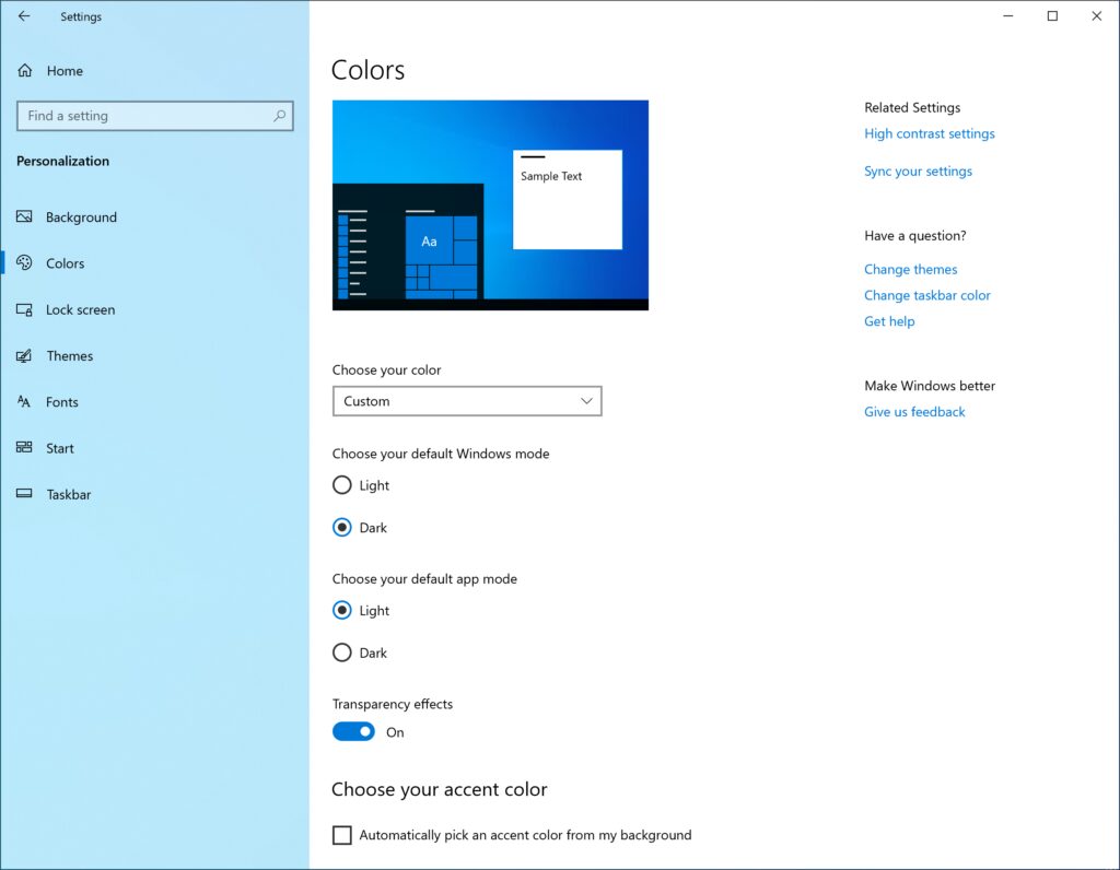
Ever since we introduced the ability to choose between light and dark in Windows 10, we’ve heard feedback asking for a truer separation between the two options. When you select Light under Settings > Personalization > Colors, the expectation is that the system color would be lighter too. And it didn’t do that before – the taskbar and many other things stayed dark. Now, if you choose Light under Settings > Personalization > Colors, all system UI will now be light. This includes the taskbar, Start menu, Action Center, touch keyboard, and more.
The new light theme is available in a preview build. And the preview build doesn’t automatically switch you to light mode; instead, it leaves things the way you left them. Meaning that you have to go into your personalization settings and manually switch it over. And even then, since it’s a preview build, things aren’t perfect, and it may be a little buggy.

For example, the OneDrive icon in the notification area (system tray) is white making it hard to see when you are using the light system color. Expect us to refine this experience.
To get this preview build, you’ll have to register for it here. Personally, though, I’m sticking with Team Dark; we get to say DAMN and hell all we want.
Source: PC Mag

