I decided to review this issue after the good luck I’ve had with earlier issues of Doctor Strange, not because this is a prelude to the upcoming film. Still, I’m waiting with great anticipation for some Strange love onscreen. I’ve loved each issue in the current Doctor Strange series, and really wanted to have a good time with this comic, but I just couldn’t, and here’s why:
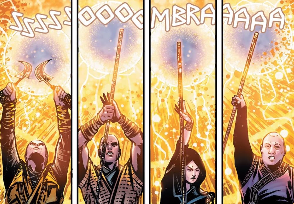
First thing first; I’m as amazed as much as I can be with the first images that the book throws at us. The level of detail we had with the main Doctor Strange series is on display here and I feel like a kid in a candy shop because of it.
Usually, I start with the script, but the art was at such a high quality I needed to change that for this time. With the first panels you realize you have a real piece of art in your hands! It’s fair to say I’m impressed by the work done by Jorge Fornés and Jesus Aburtov and I cannot wait for the what is yet to come.

Speaking about the story, which was written by Will Corona Pilgrim, it has nothing to do with Doctor Strange, but it does give us readers some clues about what the movie will be about. It’s bittersweet, since I was waiting to see what Stephen Strange’s life was like before being the Sorcerer Supreme in this new movie timeline, but I can wait a little more since we have a good wait until the film hits.
There’s a good management of action and pacing with some slower scenes tossed in that help build on some much needed emotion. I have to say that there were no pages where I felt bored while reading; some were better than others, that’s for sure, but there’s a general good quality level in the narrative and the way the story evolves with each scene.
I couldn’t stop reading for a single moment, and we’re speaking about a single issue of a limited series, so we can get an idea of the quality level for the rest. Great, cool, amazing, and all the adjectives I’m not able to think of right now easily describe this book.

The lettering in Marvel’s Doctor Strange Prelude #1 was pretty standard and did its job well. I wasn’t thrilled with it, mainly because it keeps the minimalist style in the ongoing comic series. It’s comfortable to read, but doesn’t do anything fancy or eye-catching, which isn’t a bad thing.
It’s sad to know nothing can be perfect, and in this case the only problem (at least for me)is the cover which is just a picture of Benedict Cumberbatch as the Doctor Strange and two black stripes up and down. Why not to do as with Road to War and develop a real comic cover?
It really pissed me off when I saw it first and bugged me more after reading this comic, because it deserves something better and much more elaborate than a simple picture from a photo-shoot. I’m praying to all the deities that Marvel reprints this with an alternative cover, or a collected edition with both parts or something…
Still, if we ignore this little gripe we get a near perfect issue with full of great art, amazing colors and great script.

