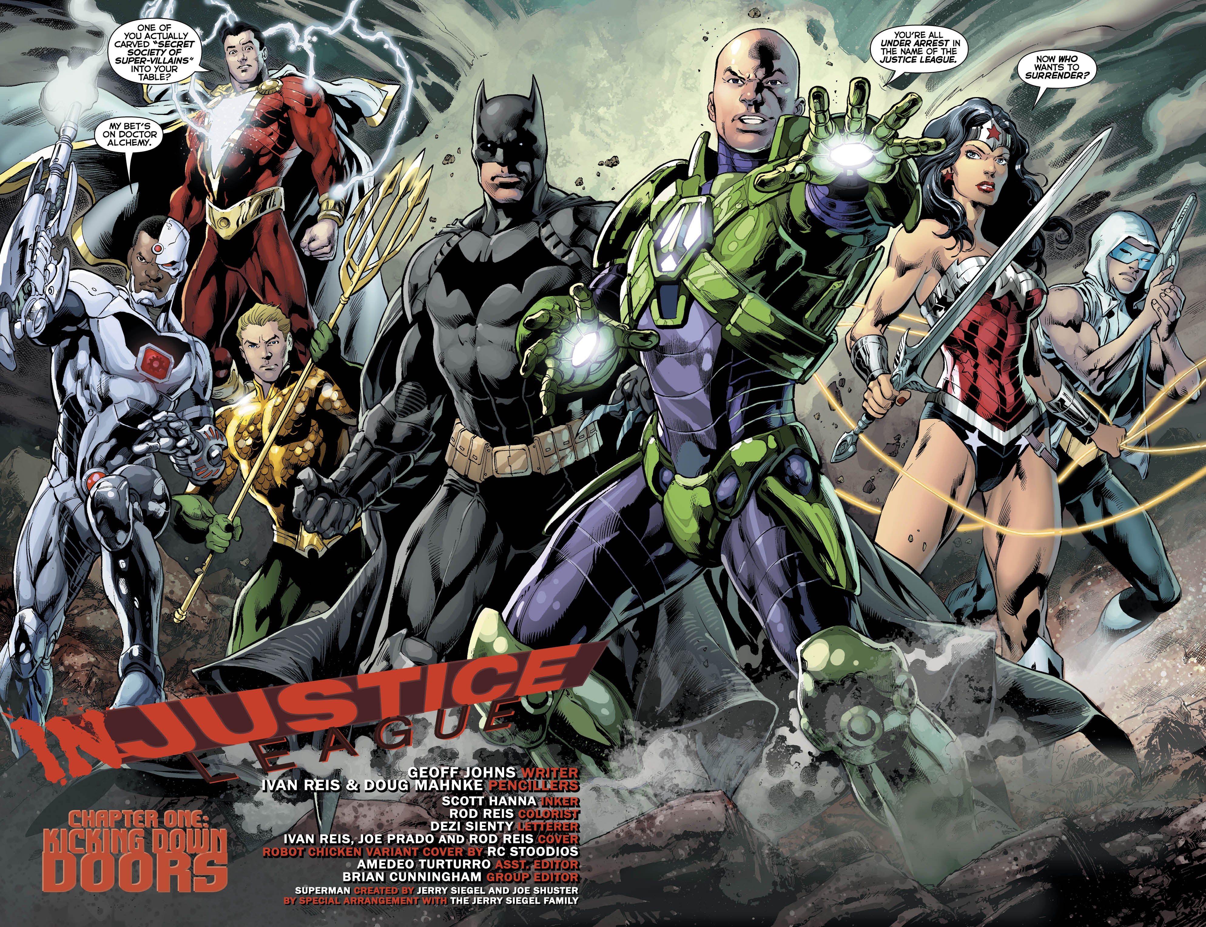
Justice League #30 opens with a bang, literally. We are treated to a brig meeting with what remains of the Secret Society (their name emblazoned on their meeting table) listing who they will destroy the Justice League when said League hurts through revealing Lex Luthor heading the team. It’s your pretty standard “here we are” scene that begs the question, “Did they line up outside in that position before blowing a hole in the wall?”
It serves to grab the reader, pulling a Memento style move and does work well. What doesn’t is Batman. You will notice that throughout the comic he is pictured with eyes, but not your normal eyes, instead the art team decided to give him these disturbing eye dots. If you’ve watched the Star Trek reboot movies you notice his eyes resemble the little alien engineer that helps Scotty about. I’m sure it’s meant to be dark and scary, but to me at least it just comes off as just gross looking.

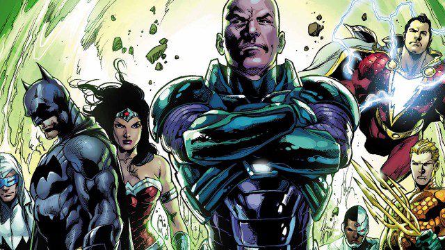
Anyway, our comic unfolds in the days leading up to this dramatic shift in league members. Luthor has saved the world and thanks in part to the media, has managed to change his reputation around in less than two-tenths of a femtosecond. Look, I know how the media likes to spin things in the real world all the time, but even is he did help save the world, he’s still a douche at best and a monster at worst.
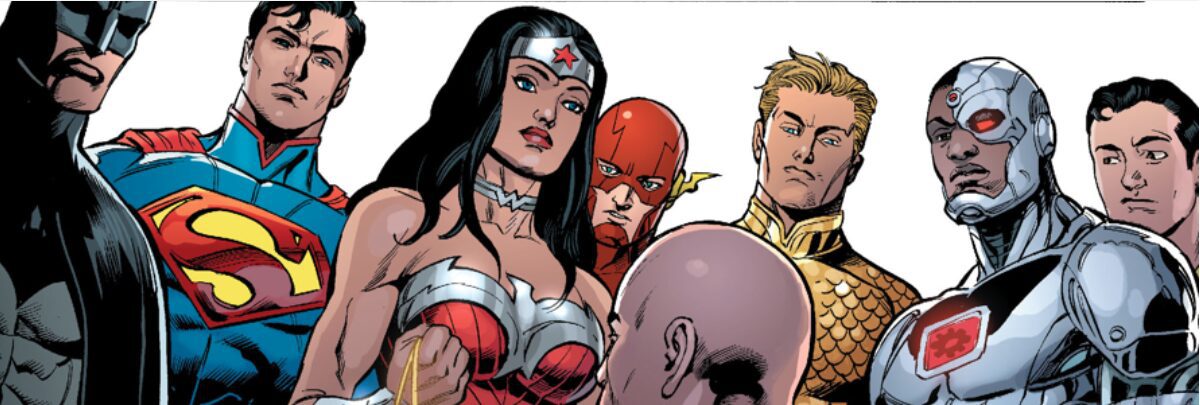
The writing was pretty hit or miss for me as a fan of these characters, and of good storytelling. I may be alone on much of this, but the depiction that Wonder Woman has received as this crazed, bloodthirsty barbarian is really starting to get on my last nerve. She’s become like that really crazy friend that you have to go out places with because if someone isn’t there, they’d end up doing really stupid things. The art is also questionable in many places (Batman’s eyes notwithstanding). Character faces take on these horrific positions ripped straight out of some B-moive horror flick when showing any kind of emotion (more prevalent on the female characters) and in on scene in particular, a scene mind you that is supposed to make things click and have the reader connect with Luthor, the entire Justice League is staring down at him while Wonder Woman’s eye’s are clearly looking someplace else (my guess is a LoL Cats screen saver).

There just doesn’t seem to be any subtly to the art work here. Everything is overly exaggerated when any emotion is in play to the books detriment. And please don’t get me started on Wonder Woman and her broken back syndrome… There is no possible way for the human body to be in a position where we can see your entire butt and both boobs facing the camera and your head another, unless the punch you just threw shattered all your vertebrate. And on top of all that, Batman is made to look like some teenager stole his outfit and replaced him when he spews out lines like:
“He’s and insect. But bats eat insects” -Batman
Come on Bruce, not even you’re that dark and brooding. Not even The Flash’s jokes can smooth over this sad situation. There is a really interesting story underneath all the inconsistent artwork. Geoff Johns knows how to craft an excellent story, but is just let down by the art department this time around.
If you are looking for a good read, you’ll find one underneath all the mediocre art work presented here. The entire middle chunk of the book pitting Lex Luthor and the Justice League in a battle of words over the events leading up to this point has some mighty fine writing. I also have to bring up the cliffhanger scene that closes out our book that honestly left me shocked and surprised, something that doesn’t happen quite often. It’s the kind of moment that makes you really excited about what’s coming next. And we want to see what comes next.

