Okay, so is this Spider-Man week on the internet or something?
You may think that with such a well-developed, well-known, easy to work with character like Peter Parker (a.k.a. Spider-Man) this would have been a good issue, especially with the characters ties to the original Civil War arc. But instead we get something that just barely hit the good mark; Maybe even a little less than that.
The script is penned by Christos Gage and is a slow-paced affair that lacked interest and simply doesn’t grab the reader. There just isn’t anything memorable here which is a shame as the character has many things to give to a story like this.
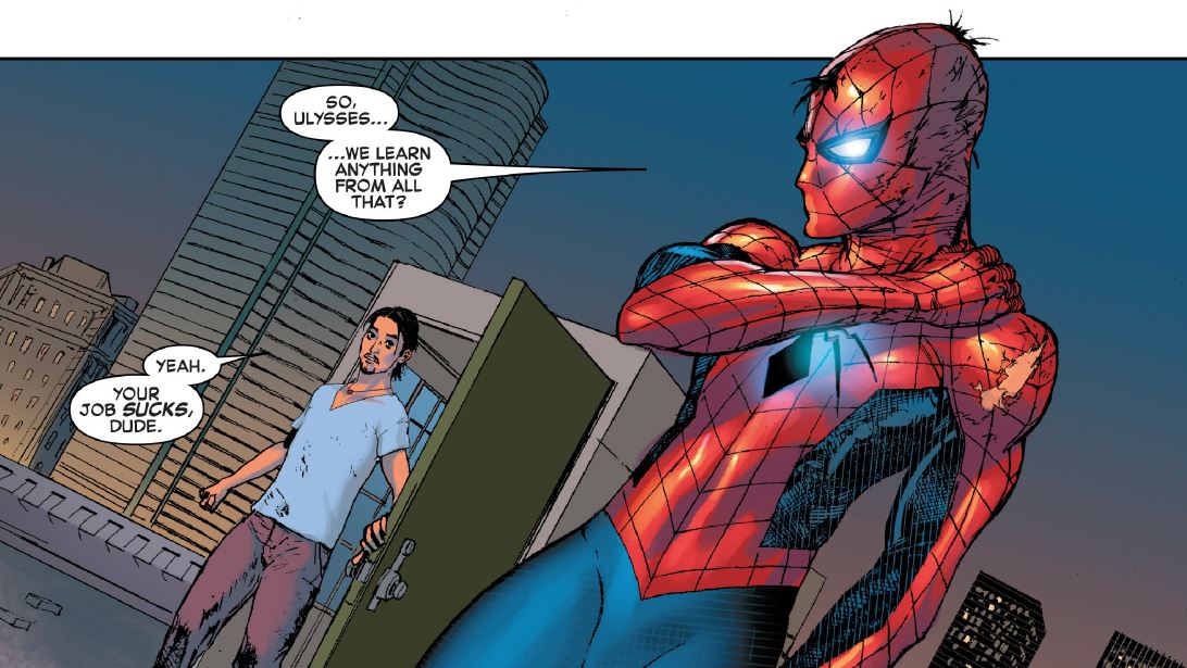
Boring, slow, and with very little doses of action sprinkled throughout. There are a few fights segments with interesting background work, but the dialogue leaves the action falling flat. I’m not going to go as far as saying it has a mechanical feel to it, but it seems like Gage wrote much of the dialogue without interest, as if he wanted to get done with it as fast as possible.

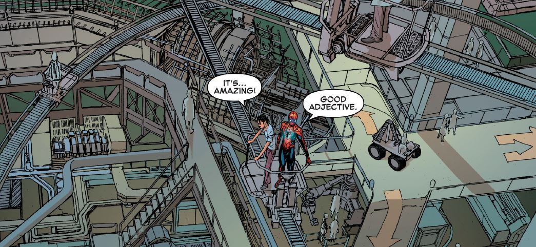
The art is the counterpart to the lacking script and it gives us an interesting look into what is otherwise banal and graceless. Travel Foreman stands out with his city scenes and some of the panels in Parker Industries are really fantastic. He adds a unique sort of enchantment to all the pages. Some little art issues, like some missed details or excess in shadows crop up a bit, but it general is excellent and the overall quality make up for these small issues.
I should, and am going to say the same thing about Rain Beredo, the colorist for this Civil War II: Amazing Spider-Man #1. The colors are vivid with a wild power that draws you in. The color work is what really kept me awake while reading, and, if I’m being honest, I would have honestly fallen asleep if it were not for Beredo’s work.
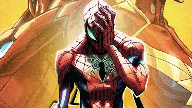
Another real shame is the cover, but mostly because the story doesn’t do it justice. Randolph and Lopez gave it a real manga-like appearance, hit or miss as you may think of that style, but it catches the eyes. The cover vibrates the senses and has much more drama than the pages inside the book. Also, you may or may not agree with me when I say this, but the cover it would look great as a poster without the “Marvel” logo and credits all over it. So as a cover it really does its job.

I could keep an eye in this one, but only for the art and colors as the story really didn’t click with me. It has some elements and characters that could fix my problems with the book in a couple of issue, and maybe we need to give it some time, but I don’t have so many expectations. Those that follow my reviews know that I’m very optimistic when it comes to comics, especially those with classic characters, so it’s hard when one doesn’t click, especially in such a big arc.
I should also mention that it bothers me a little to see a millionaire spidey. This may just be me but do we really need ANOTHER millionaire saving poor people. Marvel, don’t you know how to do more heroes without lot’s of money around them, defining them?
Iron Man, Black Panther, the Fantastic Four, and now Parker. He was one of the very few humble characters and one that struggled with the same this us regular people did. I know this is supposed to be the typical work-hard-and-you-will-succeed message, but it just doesn’t suit him.

