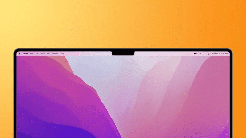
I’m going to guess that most people upset by this will still buy it anyway.
But it seems that, in their haste to minimize a bezel that was wide enough to both provide structural stability as well as host a webcam, not to mention give you more screen space, they decided to add a notch to the screen to host said webcam. And wouldn’t you know it? Almost none of the apps for the device actually work around the notch! Rather, the menu bars are obscured by this wonderful new feature.
Naturally, several stupid mouthbreathers brave Apple fans corrected this fool on his inability to understand cutting edge design.
I feel I must now enter penitence for my horrible crimes. How could I doubt the company that boldly, and bravely, eliminated that horrible industry standard 3.5mm headphone jack, or decided that a rechargeable wireless mouse should have its charge port on the bottom so that you can’t (obviously dangerously) use it while it’s charging. I’m such a horrible person, how could our lord and savior, Tim Cook, ever forgive me?
Source: BoingBoing


