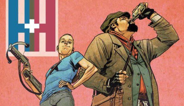
A&A: The Adventures of Archer and Armstrong #7 was a REALLY GOOD issue and one that I enjoyed immensely. It has that cheap charm and great sense of humor that I’m liking more and more with each issue. This comic book is perfect for everyone that wants a story filled with tons of funny moments alongside some great fights throughout.
Contrary to the past issue, this time the plot had the right balance between action scenes and humor. I’m glad to see some straight up action and intense fighting and hilarious comments from both characters really hit the mark. It was as if two genres of books mixing together with each taking their turn from scene to scene. But with all the comedy came Mary-Maria’s sequence which was serious as hell and I completely fell in love with it! To the writers of the book I say, no, I beg you, give us more of that!
The pace was also faster than before, with almost no scenes where the characters were relaxed or taking a break from what’s going. I liked this approach as there are times when I thought “Ok, so this is supposed to be an action comic, then where it is?” Archer and Armstrong gave me the action I’ve been craving with no hesitation.

The artwork we get features a lot of light and warm colors on almost every single page that helped a lot in getting into the scenarios and characters’ feelings. I counted a very small amount of problems overall, only really being a bit inconsistent at some point with the environment and landscape art. Still something about parts of the art feel off, like they don’t quite fit together like a puzzle.
The inks were very delicate this time around. We don’t have big, thick black lines everywhere, instead we get a lot of simple strokes. We do get many lines within a single page as a dramatic background and some shadows here and there, but nothing that may looks grotesque compared with the rest of what’s going on in A&A: The Adventures of Archer and Armstrong #7.
The only real thing that bothered me was in the last page of Mary-Maria’s scene. The other two had a black background for the panel, why then the choice in using white for the third? It didn’t make sense to me and it completely broke the aesthetic and the semiotic feel they had going on. And considering this was my favorite part of the book I’m having a hard time trying to forget about it.

Davey’s pages were not as good as before, as I consider the over acting of the bagmaker being almost ridiculous, and Davey itself was a little robotic in my opinion. A little lifeless and that’s not the kind of “humor” I like, or the kind that really makes sense to me, so I find it the only con in A&A: The Adventures of Archer and Armstrong #7. It’s really a small though and it’s more a matter of personal liking.
This sort of book is not my forte, but this is a really good issue in a series that keeps getting better and better. The Adventures of Archer and Armstrong keeps getting better issue to issue which is something hard to do. If you haven’t yet, I really suggest you all give it a chance!
4.5/5
‘Great’

